Back home from a great Gary Con, it was so much fun to meet gamer friends again after two years of hibernating at home. The bad side to it are a severe case of Con Crud, but thankfully not covid. After a day recovering in bed its time to get back to work, and first out are some more heraldry digging into Greyhawk history.
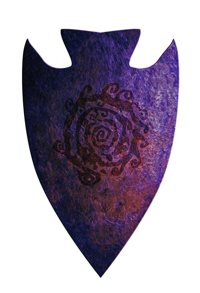
First are the infamous Tharizdun, what would a shield used by his followers look like? Below is my take on what a Tharizdun cultist shield might have looked like back in its prime.

The purple color is inspired by Mike Bridges cartoon cultists, which I tried to bled in with a some shine and harsh effects to create a slightly crazy looking shield with a magic flare.
What would such a shield look like found in "modern times" in the Flanaess. Below is my take on that, a corroded mess shipped away at the edges. Tharizdun doesn't offer much protection from decay even for his own magical items, but some of its power are still present.

Next up is everyone's favorite (it seems) Vecna. The first shield is from the time of Vecnas tyrannical rule of the Flanaess, when he still has both his hands and eyes and was working on his lichdom. His symbol has an eye in the center with radiating spokes, meaning he the ruler of all that sees everything.

Below is what that shield might look like found in a hidden stash in the late CY 500's.

In a bad state but much better than the sorry state of the Tharizdun shield.
Finally a look at the Knight Protectors of the Great Kingdom and their heraldry over the years. First is the initial shield they used in their early days after saving the Overking from some sort of a dragon.

The design is from the 3rd edition Sword and Fist supplement.
Next is the LG version of the Knights heraldry, the black Aerdy Cranden base later used during the Cranden hold of Rauxes. Didn't like this design at first but its is starting to grow on me a bit.

and finally a design by Brian Blumklotz sporting a pattern of Aerdy stars on the later Great Kingdom Blue.

I can see this design being adopted as a way of "depoliticize" the order and make it about the Empire and less about Heironeans and Hextorians.
This was it for today, I will get into the hexed version of the Flanaess & Hepmonaland map now.